The Stats Guy: The map that shows just how rare Australians really are


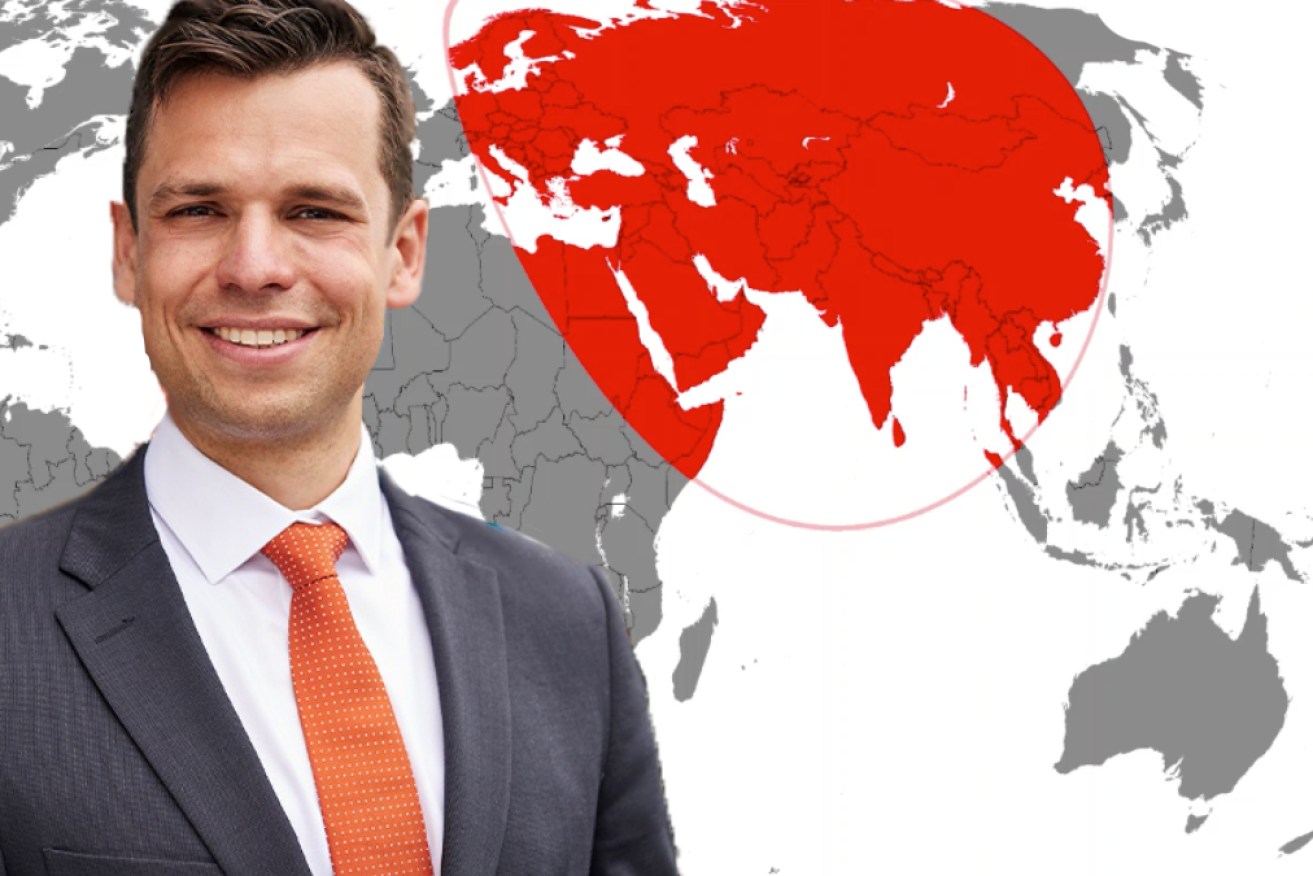
This animated map shows the smallest possible circles containing 1 per cent to 100 per cent of the global population. Photo: GHSL/TND
The last week of parental leave for your friendly neighbourhood Stats Guy is about to come to an end.
Today I’m showing you one of my favourite maps before resuming my regular, bi- data-driven column next week.
This lovely, animated map shows the smallest possible circles containing 1 per cent to 100 per cent of the global population.
At the beginning of the animation, we see the big Asian population clusters.
It’s not until the 100 percent mark that Melbourne enters the circle.
I find this map a marvellous piece to show just how isolated Australia really is.
Demographer Simon Kuestenmacher is a co-founder of The Demographics Group. His columns, media commentary and public speaking focus on current socio-demographic trends and how these impact Australia. His latest book aims to awaken the love of maps and data in young readers. Follow Simon on Twitter (X), Facebook, LinkedIn for daily data insights in short format.


