‘A very bad move’: How Australia’s $10 million ‘Twiggy’ Forrest-backed logo could cost the nation

Developed at a cost of $10 million, Australia's new trade logo has been a bit of a flop. Photo: TND/Getty
A controversial logo commissioned by a council led by mining magnate Andrew ‘Twiggy’ Forrest at a cost of $10 million to the Australian public has been slammed as a huge waste of money.
The logo, featuring a gold wattle and the letters ‘AU’, was unveiled on Tuesday and is set to replace an existing logo featuring boomerangs and the words ‘Australia Unlimited’ that Australian businesses use to represent themselves overseas.
It immediately drew criticism online, with the design criticised for resembling a coronavirus, and being too similar to Australia’s NBN logo.
Others have argued the design’s focus on gold (Au is the symbol for the chemical element) heavily favours the mining industry at the expense of other businesses.
Australia's new logo is literally in the shape of coronavirus pic.twitter.com/M3E7EUJwSw
— Cam Reddin (@CamReddin) June 30, 2020
The logo was overseen by the Nation Brand Advisory Council, an industry-led body established by the federal government in 2018 to assist in crafting Australia’s brand.
The NBAC comprises 12 of the nation’s most prominent corporate executives, and is chaired by Western Australian mining billionaire Forrest, who recently procured $200 million worth of COVID-19 test kits from China for the Australian government, millions of which are feared will go to waste.
Other members include Qantas boss Alan Joyce, Australia Post chief executive Christine Holgate and Atlassian billionaire Mike Cannon-Brookes.
Trade Minister Simon Birmingham rubber-stamped the new logo, with taxpayers to foot the $10 million bill for the campaign of which the design is a part.
Senator Birmingham said the rebrand aimed “to provide an overarching framework that can allow us to have some consistency in our approach”.
“Because it is one of the common refrains of criticism that we’ve had over the years, which is that each of our states go out and they present themselves in an entirely different way,” he said.
Where the logo goes wrong
The new logo makes no sense financially, or from a branding perspective, Deakin business school marketing expert Michael Callaghan told The New Daily.
“It is a very bad move. It’s throwing away all of that psychological attitude development that’s built up around the old logo completely,’’ Dr Callaghan said.
“It’s like The New Daily changing their name and using a different font. No one’s going to know who you are. You just changed your logo.”
Logos are a long-term investment for companies that are used to build brand recognition and promote positive associations in the minds of consumers.
Dr Callaghan said the Australian government had already spent enormous sums of dollars “burning [the original logo] into consumers’ minds”.
“Over time, given the amount of money spent on advertising, design, placement, all of those sorts of things, it is a significant investment,” he said.
“In terms of the Australian Made and the Australian identifier, we are talking millions, if not tens or hundreds of millions of dollars that have been spent in brand recognition for those logos.”
Dr Callaghan said that “any change of any logo, particularly one that’s representing a country that is funded by taxpayers, should not be sudden and substantially different to previous logos”.
A new logo is only usually commissioned when a previous one becomes tainted with negative associations, he said.
In this case, the original logo should simply have been “evolved”, he argued.
It is absolutely, fundamentally insane to just suddenly change gears and put a new logo out there,’’ Dr Callaghan said.
“If a new logo is desired because the current one is considered to be outdated, the solution is to evolve that logo into the new thing that you want, and all wise organisations understand this.”
Dr Callaghan said that the new logo could make things difficult for Australian businesses overseas, and questioned whether NBAC’s strong connection to the mining industry through Mr Forrest may have influenced the design.
This logo is so significantly different that people are not going to immediately identify businesses carrying that logo as being Australian businesses,’’ he said.
Dr Callaghan criticised NBAC for producing a logo that may be favourable to mining interests – like that of its leader – but is not representative of “a broad range of businesses that are likely to need to use the logo”.
The new Australia logo.
I served with the UN in the Sahara Desert. We travelled to a tiny village called Agwanit in Mauritania. A boy about 10 pointed to my shoulder patch and said Kangaroo!
He knew where I was from.
The new logo is meaningless.
— Old Soldier (@OMGTheMess) July 1, 2020
The new logo is void of any “essential basis of of meaning and iconography” that would be recognisable as Australian overseas, Dr Callaghan said.
“It draws more connections towards mining and virtually no real connections towards Australia because it doesn’t have kangaroos, boomerangs, anything memorable in it.”
‘Australian Made’ kangaroo logo to remain

The Australian Made logo has been around for 34 years, and it isn’t going anywhere.
The logo’s launch caused mass confusion, with many incorrectly assuming that it would replace the iconic ‘Australian Made’ kangaroo logo that appears on consumer goods.
That logo has been used for 34 years, and will remain the same save for an update of the colour scheme to a darker green and gold.
“The iconic green and gold kangaroo logo has been clearly identifying Australian goods in export markets for more than 34 years with great success,” Australian Made Campaign chairman Glenn Cooper said.
“There is no need to make a change in this space.”
Want to see more stories from The New Daily in your Google search results?
- Click here to set The New Daily as a preferred source.
- Tick the box next to "The New Daily". That's it.

Premier faces leadership challenge as election looms

Hanson loses appeal over ‘seriously offensive’ tweet
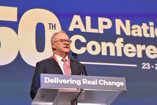
PM charts course to election victory
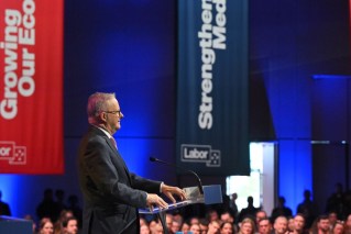
Albanese's 'disciplined' Labor risks a big mistake

Labor elder warns of authoritarianism