This Australian developer is working to make the government’s vaccine data more accessible

Developer Ken Tsang has released his own vaccine dashboard using government data. Photo: TND
Sydney software developer Ken Tsang has a knack for building tools to help people get through the pandemic.
When COVID-19 cases cropped up last December, he made an interactive map of exposure sites called COVID-19 Near Me.
When a lack of vaccines hampered our rollout, he added a map of clinics that showed their availability.
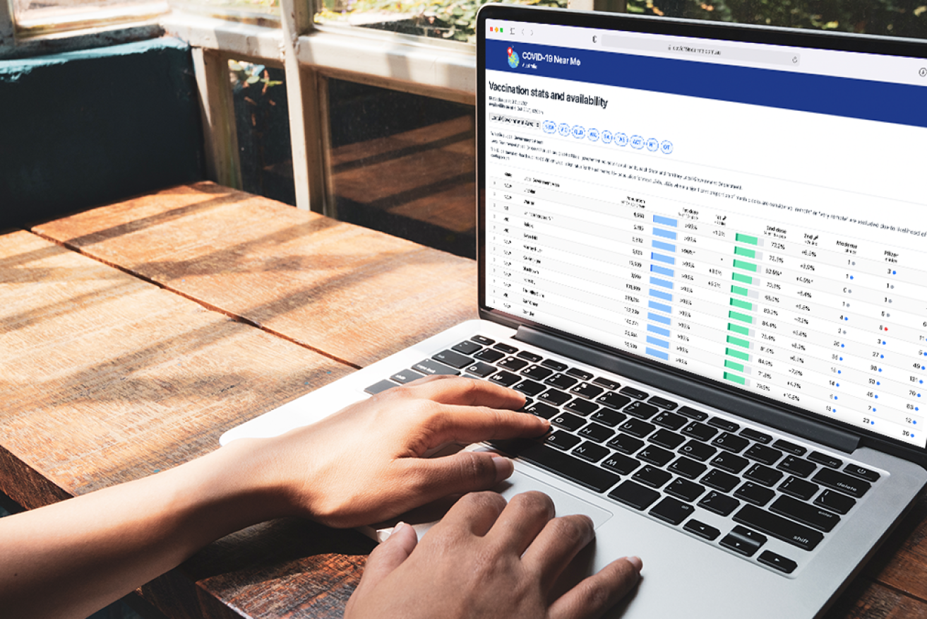
Mr Tsang’s latest tool is an interactive dashboard for Australia’s vaccine statistics, sortable by state, region and local government area.
“For me, I found it difficult to be able to track how a particular region has been going over time,” he told The New Daily.
That’s why he scraped the data from the government’s daily snapshots and presented them in a way that made our vaccination progress more visible.
The dashboard shows what percentage of an area has been vaccinated, and how many clinics are operating there.

Ken Tsang’s vaccine dashboard allows people to monitor vaccination rates by LGA. Photo: Supplied
Mr Tsang started scraping the data from various spreadsheets and PDFs back in August, and this information has gone on to be used by all sorts of Australian creators in various tools.
But he only started working on a dashboard of his own in his spare time a week ago, after deciding the government’s snapshots were too inaccessible for ordinary people.
“I think they’ve done a much better job at presenting the headline figures at a state level or a national level,” Mr Tsang said.
“But at a regional level, it’s still pages and pages of names of locations, and it’s hard to understand.”

Ken Tsang has been building tools to help Australians navigate the pandemic. Photo: Supplied
One unique feature compared to other vaccine dashboards are the dots that show how many appointments are available in a given area for the Pfizer, AstraZeneca and Moderna vaccines.
A blue dot means there are free appointments in the next two days, an orange dot means there are free appointments within a week, and a red dot means there are only free appointments after a week’s time.
“A lot of the discussions that people have are, ‘Oh, look, the vaccination rate in Byron Bay is very low compared to the rest of New South Wales’,” Mr Tsang told TND.
“The question is, is that because of vaccine hesitancy, or is that because they don’t have access to vaccines and they need to wait more than two days or more than seven days to get a vaccine, whereas in other parts of NSW they’re more readily available.
“So I wanted to present that kind of information in one place.”
The data scraping has sometimes been a struggle.
Mr Tsang said it can be frustrating when the government changes a single column for no apparent reason.
But each time something went wrong, he was game to jump back in and fix it.
Aside from the other features on COVID-19 Near Me, Mr Tsang has also collaborated with other creators on projects such as Friendship Island.
“I enjoy doing this kind of stuff, and I’m glad I’m able to help people in the process,” he said.
“That’s something that I always do – I build the kind of tools that I find I need, and hopefully, in the process of building that, I can help other people along the way as well.”