Apple staff running into glass: The company’s design philosophy flaw
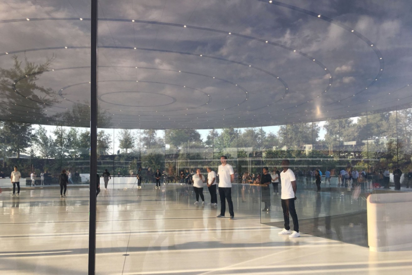
Apple's new California headquarters, Apple Park, are leading to injuries. Photo: Twitter
Apple has encountered a problem with windows – the headlines practically write themselves.
A few days ago, MarketWatch reported the massive, clear glass panes used extensively in the design of Apple’s new multibillion-dollar “spaceship” headquarters were leading to injuries.
It reported people had been walking into glass walls and doors at the new offices, leading to minor cuts.
Others reported that employees started remedying the situation by putting sticky notes over the glass.
The fix didn’t last long though, with the notes taken down “because they detracted from the building’s design”, according to The Verge.
As silly as the idea is of employees smacking into walls they can’t see (their attention perhaps sunk into the mobile phones they themselves invented), it reinforces the design philosophy Apple has been running with for years – the focus on form over function.

Apple is known for heavily valuing aesthetics. Photo: Twitter
For all of Apple’s best-selling products and high customer satisfaction ratings, there have been some unholy design blunders along the way in the quest for beautiful objects rather than functional ones.
You don’t need to look far.
Just last year we had “the notch” – the cut-out at the top of the iPhone X’s screen which was derided across the internet for its impact on the phone’s interface.
In the company’s mission to include an edge-to-edge screen that covers the whole front of the device, a compromise had to be made to fit in the front-facing camera and other sensors.
Others, like Samsung or Google, might have left it as a black bar above the screen, but Apple went for a notch to get those corners in there.
This led to some weird user interfaces that made the 5.8-inch screen feel a lot smaller than it actually was.
In landscape mode in particular, you have the notch either eating into the side of the video or black bars rendered on either side, drastically reducing how big the video feels.
Web pages might be the worst offender, having to render white bars on both sides too, wasting more space in the goal of achieving symmetry, not function.
Don’t worry, the hiding scroll bar is even grosser (top-right corner). pic.twitter.com/6ImBLI9TdM
— Ben Packard (@BenPackard) September 13, 2017
Not so magical design
Perhaps nothing is more blatant in the battle between looks and usability at Apple than the Magic Mouse 2.
Consider for a moment that you have been tasked with designing a wireless mouse that needs charging every now and then. Where would you put the charging port?
Probably not here.
The Magic Mouse 2 needs to be flipped on its back, exposing its belly, when you want to charge it.
https://twitter.com/tianaw96/status/937095950052610053
Most other competitors would let you plug the cable into the same spot as a wired mouse so you can continue using it while it charges.
But as you might have guessed with Apple, hiding an ugly charging port from view is clearly more important.
Is Apple still for the pros?
It’s worth pointing out that last year Apple attained the title of the most profitable company in the world.
They didn’t get there with wall-to-wall flops. They have tons of product successes and legions of loyal customers.
It’s hard to fault any company when their products work, when they’re intelligently designed and when they help enrich our lives.
But where someone else might say, “maybe those walls should have markings on them for health and safety reasons”, Apple will say “that’s not our vision for the design”.
That sort of thinking runs deep within the company, even leading to products falling flat when what Apple thinks people want doesn’t match with reality.
Remember a few years ago when Apple was hailed for its unusual but very nifty “trash can” design on the Mac Pro?
The tiny computer is designed for professionals who need a lot of computing power for things like video editing.
The cylindrical shape lets Apple squeeze the components close together around the sides, letting all the heat produced gets funnelled into the middle and ejected out the top of the device.
Sounds smart, right?
When it was unveiled, Apple executive Phil Schiller quipped to a packed auditorium keen to see something truly new from Apple: “Can’t innovate anymore, my ass!”
It was a marvel that they fit such a powerful computer into such a small package.
But the problem was that professionals didn’t care about size. They cared more about how easy it was the upgrade the components.
It turns out it wasn’t easy at all.
Mr Schiller now says he is “completely rethinking the Mac Pro”, making a new model currently under development more modular.
At least Apple has shown that it can adapt when it swings and misses.
Perhaps it’s time for some frosted glass?
-ABC


