The world map is wrong. Here’s how it really looks

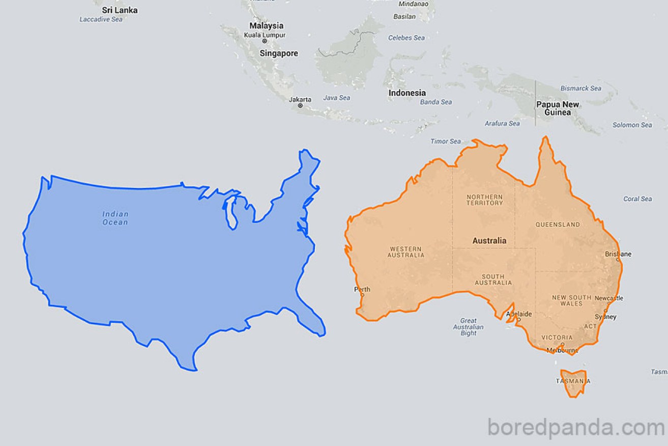
America (left) and Australia adjusted for distortions often seen on maps.
If only we could drag Greenland to warmer climes, harvest the ice and settle it with the millions of people looking for a new home. After all, on the map – the reliable map used for navigation for more than 400 years – Greenland is bigger than Africa!
Except it’s not.
Greenland is about two million square kilometres. Africa is more than 15 times bigger at 30.24 million square kilometres. Were the mapmaker’s drunk?
The Mercator Projection, the map most people grew up with on their classroom wall, is afflicted with massive distortions of country and continent size – such that many people argue it’s a geo-political conspiracy to make poorer continents, like Africa, feel worse about themselves.

Greenland’s real size is misrepresented on most maps.
European countries, for example, look bigger than countries closer to the equator. The distortion actually arose from translating the world as a globe into a flat map – called a projection – with a grid of latitude and longitude lines that sailors could efficiently use for navigation.
The first to achieve a projection was the Greek genius Ptolemy from 150AD, well before much of the world was known. His grid was accurate and rightly showed that each latitude line – those going north and south – were of the same size and distance apart.
But it also showed that longitude lines – those that measure travel east and west – converged as they got closer to the poles. In other words, he based his projection on the idea that the world was spherical. His grid remained the favoured template for mapmakers for 1500 years.
The problem, though, was the rhumb line – the line of a steady course or line of bearing from a single compass reading – used by sailors followed a curve on the Ptolemy grid, instead of a straight line. This meant they were constantly recalculating their bearing as they sailed along.

Image showing how Greenland may be presented more accurately.
In 1569, the Flemish cartographer Gerardus Mercator solved the problem by ignoring the fact that longitude lines converge, and latitude lines remain an equal distance from one another.
Instead, his grid was based on a grid of rectangles with the latitude and longitude lines meeting at 90 degree angles. To account for the globe shape of the world, Mercator blew out the size of the rectangles on the map as they grew away from the equator, which then distorted the size of the land masses. It wasn’t an accurate picture of the world, but it provided an accurate basis for navigators to chart their courses using a convenient straight line.
Over the years, many cartographers have tried to solve the problem resulting in a vast array of new projections. None have completely solved the problem of distortion.
An emerging winner, for the moment, appears to be the Winkel tripel projection, invented by Oswald Winkel in 1921. The “tripel” refers to his three goals of minimising distortion of area, direction, and distance.
In 1998, the National Geographic Society adopted the Winkel tripel as the standard map. Schools and other geographic societies have taken the same route. So to speak.