Google changes logo to match new name

Tech giant Google, now legally known as Alphabet, has rebranded for the fifth time in the wake of a major company restructure.
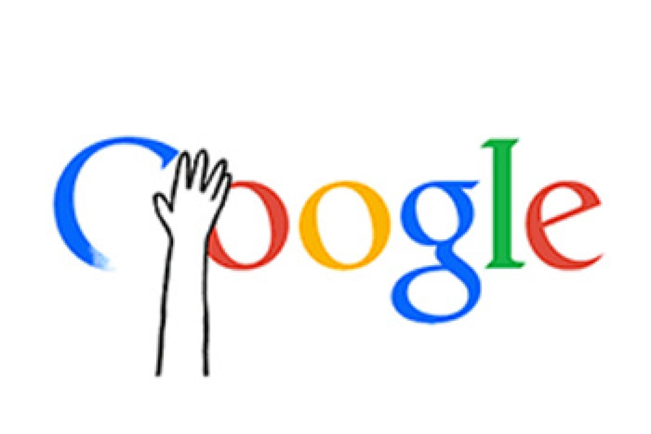
On Wednesday morning (AEST), the corporation unveiled a series of subtly tweaked logos it described as ‘simple’, ‘uncluttered’, ‘colourful’ and ‘friendly’.
• Ten tips for Dyson Heydon on how to use email
• A new smartphone is coming … with buttons!
• How online dating can be a total waste of time

Here’s what the old logo looked like.
The new branding will be rolled out across the company’s product range “soon”, two of its executives promised.
“As you’ll see, we’ve taken the Google logo and branding, which were originally built for a single desktop browser page, and updated them for a world of seamless computing across an endless number of devices and different kinds of inputs,” Tamar Yehoshua and Bobby Nath said in an online statement.
The letter style of the new logo matches that of Alphabet, the holding company created by Google’s founders in August, which now technically owns all of their billion-dollar projects.
“We think we’ve taken the best of Google (simple, uncluttered, colorful, friendly), and recast it not just for the Google of today, but for the Google of the future,” the executives said.
The company known as Google continues to directly manage all of the high-profile enterprises, including web search, YouTube and Android.


